
Washington Woods Trail
This project was the culmination of my Design Systems 2 course that took place in the Summer of 2020. In this project, students had to develop a signage system for a nearby location, taking into account aesthetics, usability, existing branding, and the audience for each system.
I chose to use a walking trail near the Washington Woods Elementary School as the location for this project, developing a system of signage intended to help satisfy the means by which current signage in this area was lacking. I needed to design a system that would be able to help with navigation and education without hindering the current appeal of the site as a small and quiet place that is easy to travel and relax within.


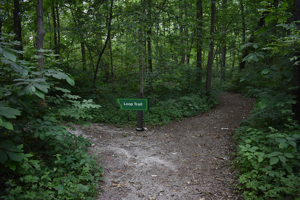


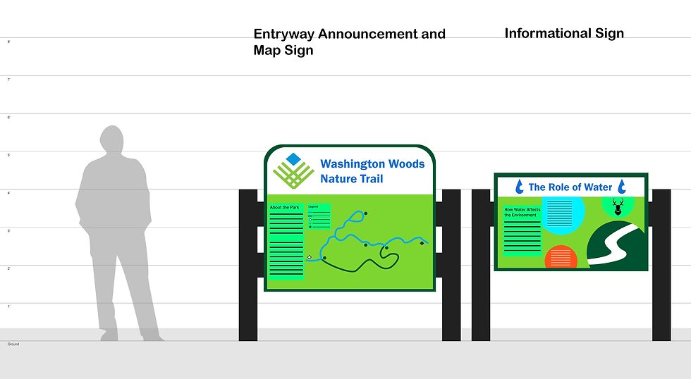
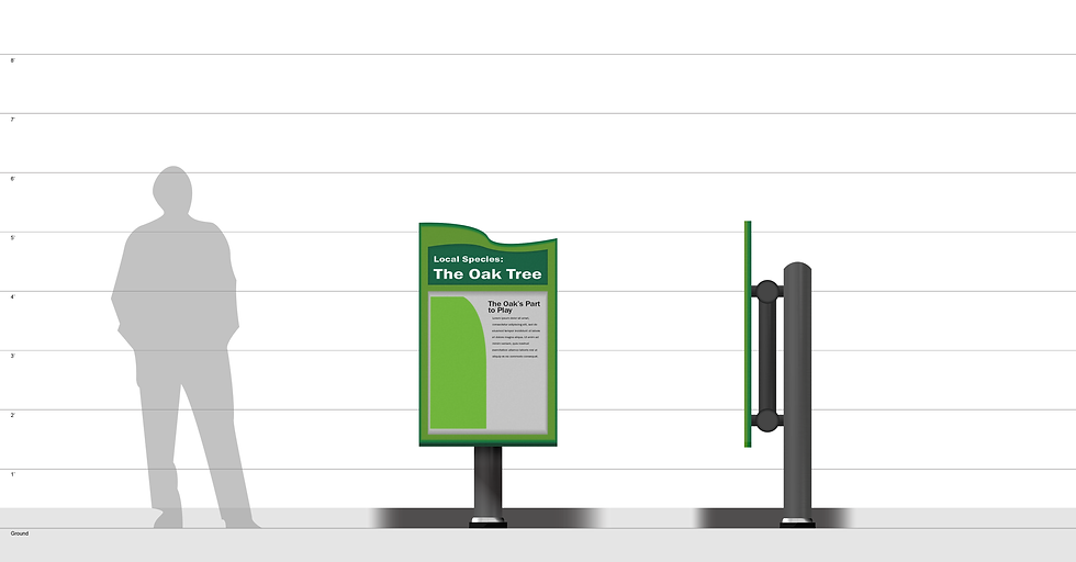
Pictured here are the primary components of this sign system, including identifying signs located by the road and at the end of the school parking lot, navigation signs to help orient oneself through the trail, and informational signs to help with the educational aspect that would be appropriate for the trail considering its proximity to an elementary school.
Process
User Interviews
I initially selected this site due to it possessing ample potential for revised signage and close proximity to two trafficked areas, which made navigation within this space a greater necessity.
To begin, I first defined the three major categories of stakeholders with this space, and questioned them about what they saw as the site's strengths and weaknesses. I then synthesized insights that stuck out to me across all of the interviews.
Category: User/Stakeholder
Local Student
How did you use the site?
"My family and I use it to walk our dogs in the evening or morning when it’s warmer, and we’ll play Frisbee or just let them run around in the field between the Woods trail and the Freedom Park trail."
For what purpose did you use the site?
"It’s very close to our house and it provides us with an open space we can easily use."
Does it meet your expectations?
"Most of the park and trail is pretty well maintained, but it could use more signage to help with navigation and it has potential for educational use."
What motivates you to choose this site?
"It’s very close to my living space and we don’t need to drive to get to it."
Category: User/Stakeholder
Parks & Recreation Superintendent
How did you use the site?
"It connects users to the Freedom Trail Park, and has been used for both casual use and by the High School Cross-Country team as a running course."
For what purpose did you use the site?
"It’s a central location that still contains a relatively undeveloped ecosystem."
Does it meet your expectations?
"It needs to be aligned with regulations such as the ADA and maintained like all other parks."
What motivates you to choose this site?
"The site’s ecosystem. It’s a forest, and it’s quiet. It gives them an opportunity to separate themselves from the development of Westfield."
Category: User/Stakeholder
Those Interested in Nature
How did you use the site?
"We use it to hike with the dog or walk on our own. We’ve also seen kids from the high school use it to get from the residential areas into town, or the other way around."
For what purpose did you use the site?
"It’s one of the places in walking distance with older trees and more wildlife than others."
Does it meet your expectations?
"Yes, it’s mostly just a serene trail through the woods. However, it’s lacking some in navigation, and it could do with a looping trail to help in navigation."
What motivates you to choose this site?
"Close proximity to living space and the presence of wildlife compared to other parks."
Interview Summary
How do users make use of the site? Does this match how the site is designed?
Users use the site primarily for leisure and recreation, as well as for foot travel between two different parts of town. This does match the site’s primary purpose as being a trail, but other users use the site to explore nature and in this way, the site is lacking.
For what purpose do users use the site?
Users use the site to explore nature, travel between different locations of the town, and as a place to exercise and otherwise use leisure time.
Does it meet user expectations?
It mostly meets user expectations in the sense of being ADA accessible, having well-maintained trails, and generally well-cleaned. However, it’s lacking in terms of navigating materials and other informational signage.
What motivates users to choose this site?
They choose this site because it’s simultaneously secluded from and close in proximity to more developed parts of the city. It’s easy to learn the layout of and understand while still being part of a living ecosystem.
Designed Path & User Journey


I also made my own map of the site to use as a reference, taking care to note down specific features of the site and the decisions users would have to make as they ventured through the site. I used that to develop a "breadcrumb path" of specific steps that the users would face.
Visual Referents
To develop the content of this project, I compiled together a moodboard that would help better carry across the mood and tone that would shape my work. I wanted to create a system that reflected and meshed with the nature around it rather than replace it.
After developing the moodboard and examining existing branding material, I created a kit of parts including basic components, icon concepts, materials to use, color hierarchy, and typography. These would provide the components I would use to create my initial concepts.


Initial Concept Directions


Concept Development
I took influence from the three possible concept directions and used them as the basis for later progress. I eventually developed five specific categories of signs within the project, consisting of entryway signs, navigation signs, indication signs, information signs, and classification signs.
Iteration 1


Iteration 2


This first series developed concepts for each of the five major sign types, utilizing green as the primary color so that the components would mesh well with the existing parks department branding and the greenery around them.
Iteration 3


The next iteration further revised the structure and imagery of each sign, better analyzing the size and scale they would need to exist at to function.
Final Iteration
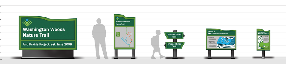


The final iteration includes the ultimate version of each sign type, the measurements for each component, and the materials used, as well as the final version of the signs' content.